Projects
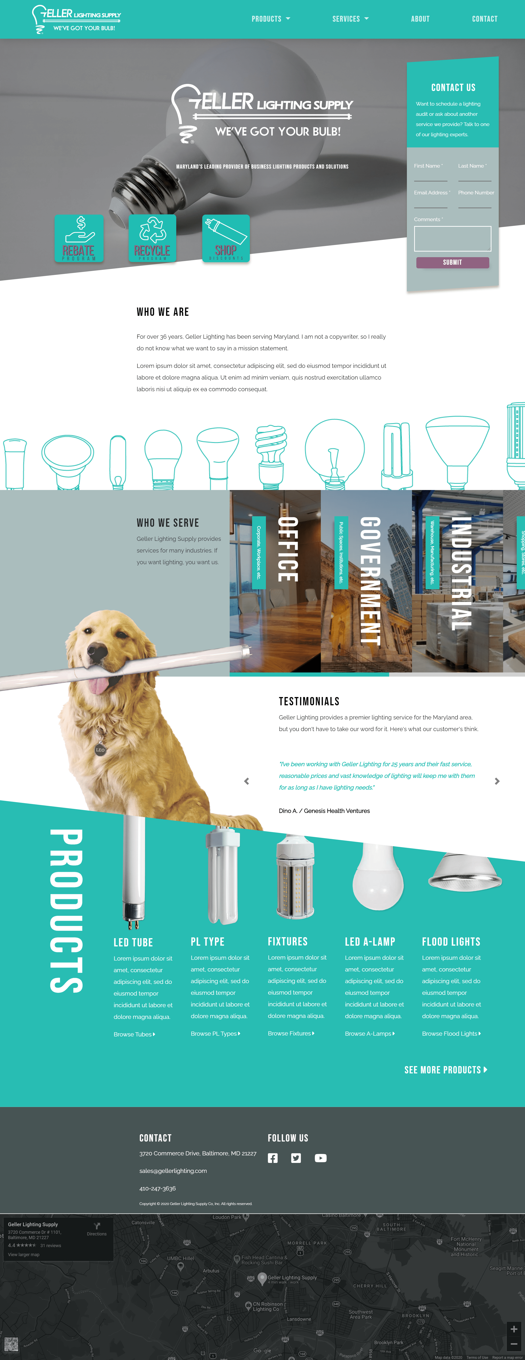
Geller Lighting Supply Redesign
Home Page - Desktop

This project was a redesign of the main Geller Lighting Supply website. This project was eventually tabled due to new conditions due to Covid 19. But, there was a lot of design elements I was happy with, specifically on the home page shown here. I really like the way the CSS clip-paths break up the page. It allows the website to have a less boxy, something that can be a bit of an issue with bootstrap/flexgrid based sites. Although CSS clip-paths are not supported in internet explorer, our traffic data suggested that would not be much of an issue. You can learn more about this project here.
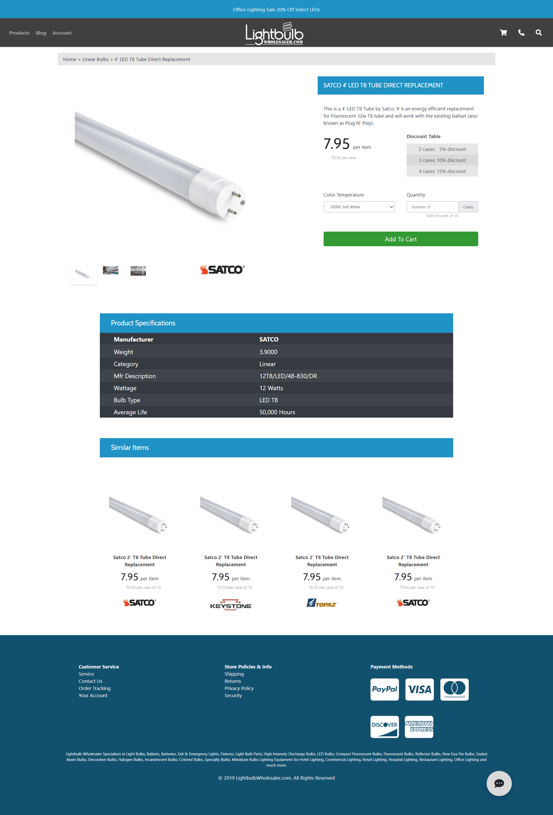
Lightbulb Wholesaler Redesign Demo
Product Page - Desktop

Navigation Animations
This project was a redesign pitched in an internal presentation about the future of Lightbulb Wholesaler. This project was delayed due to constraints with the company development equipment, but the design still has elements that I like a lot. The animation for the product based navigation was an element that I really like. It was done with css animations and some jQuery scripting. The mobile version of this animation was not fully fleshed out for the project, but that is something I would like to revist as I can see myself using similar styled navigations in the future. Users like elements that respond to their inputs and I think elements on the Lightbulb Wholesaler Redesign Demo did that well. You can learn more about this project here.